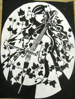
Four to five images of various artists' work
Black background
White background
February 12, 2011
Native vs. Human
Overall: Lots of repetition was used in this project, with the amount of lines, etching, patterns, round shaping. The negative space/shape jumps out at you because of the geometric shapes small-medium and small in this composition. You can tell exactly what my image was drawn from which was not the point of this assignment; it should have been more abstract and elusive, thus I was unsuccessful in creating a non-representational composition.
White background: I didn’t capture the positive and negative space within this project, I don’t believe that the difference between my figure/shapes and the background work well together, it doesn’t allow your eyes to rest, neither the white background nor the black shapes are captured gracefully within this composition; you can see the separation between the two due to the sharp contrast of the two bold colors. The image runs off the paper but yet the black still doesn’t fill in the space enough for a pleasant and fulfilled feel.
The directional force in my composition pulls your eyes to the bottom left because it is heaviest on this portion of my piece and the change in the shapes and repetition make the eyes rest on the bottom left hand center piece, which imitates a geometric flower.
I do believe that there is a feeling of unity with the shapes that allows the subject to flow well, one piece connecting to another.
Black background: Had the positive image (white) be as clean as the composition with the white background, this piece would have been by far my fav of the two. Leading me to another point, black back grounds are softer on the eyes, after looking at a white space, white light for two long can make your eyes blur and hurt. Same rules apply that I mentioned above, the entire composition wasn't non-representational (excluding the remaining pieces from this work) and this frames cut outs were messy, plus the selection wasn't glued sound to the board.


No comments:
Post a Comment